Warming Stripes visualizes our warming world. The trend is unmistakable.
Maybe you have noticed pictures with these blue and red stripes in social media channels like twitter or Facebook lately.
Beyond being a pretty cool looking on its own, this images tells an important story:
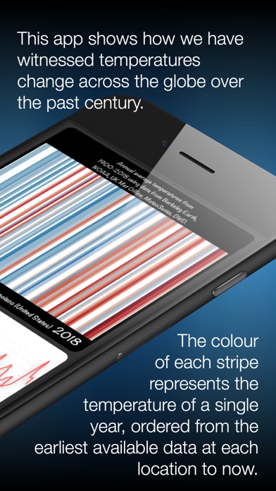
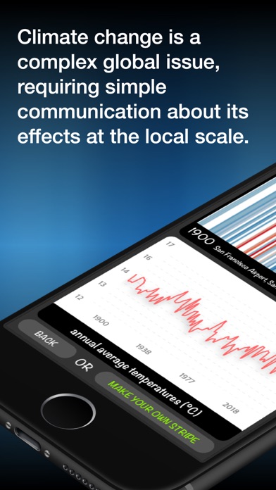
Climate scientist Ed Hawkins created the blue to red images to visualize the warming our planet has been going through. While there are many sources of information that provide more specific details on how temperatures have changed, these graphics were intentionally designed to be as simple as possible to spark conversations about our warming world and the effects of climate change.
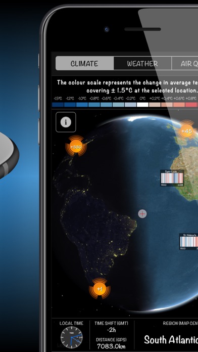
The ‘warming stripe’ graphics are visual representations of the change in temperature as measured in each country over the past 100+ years. Each stripe represents the temperature in that country averaged over a year. For most countries, the stripes start in the year 1901 and finish in 2018.
For virtually every country or region, the stripes turn from mainly blue to mainly red in more recent years, illustrating the rise in average temperatures in that country.
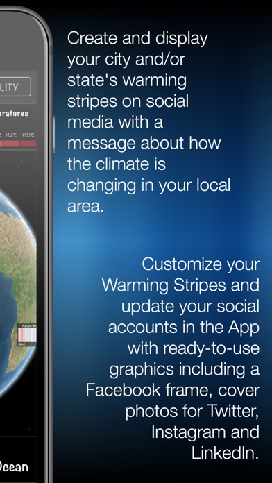
With the app "WarmingStripes" you can create these graphics for your region, combine them with your avatar or other information and share them with a few clicks on Twitter, Facebook, Instagram etc.
Further information is also available at
- https://showyourstripes.info
- https://www.climate-lab-book.ac.uk/author/ehawkins/
- https://www.climate-lab-book.ac.uk/2018/warming-stripes/
